
You're probably looking at a stack of month-old reports, a QuickBooks screen, a payroll notice, and a text from somebody asking whether cash is “fine” this week. That's the normal Jacksonville small-business mess, and it's exactly why a business performance metrics dashboard stops being a nice-to-have and starts becoming the thing that keeps you from making dumb, expensive decisions on a Tuesday afternoon.
The point isn't prettier charts. The point is seeing, fast, whether cash is tightening, labor is drifting, or a compliance deadline is sitting there waiting to bite you. A good dashboard gives you one place to watch the numbers that matter, with the right targets, the right owner, and the right context, so you can act before the month is over and the damage is locked in.
If you want a useful benchmark for how a dashboard should feel, visualize business performance and compare that to the pile of reports most owners tolerate. The difference is obvious. One helps you decide. The other just records what already happened.
For a deeper look at why this matters beyond appearances, the logic behind why your business needs a financial dashboard is simple, even if the execution isn't. A dashboard only works when it changes the next move you make.
Takeaway: If the dashboard doesn't change a decision this week, it's not a management tool. It's wallpaper.
The Moment a Dashboard Changes Everything
A Jacksonville owner I'd bet you'd recognize is staring at three spreadsheets on a laptop, one on the desk, and a voicemail from payroll. Revenue looks “about right” at a glance, but nobody can say whether the cash balance matches the timing of bills, whether labor ran hot, or whether the month's compliance work is on track. That's what running blind looks like. It feels busy and professional right up until a deadline lands.
Then the dashboard goes live, and the first thing that jumps out isn't some fancy graphic. It's a cash-flow drop that was hiding under a pile of flat-looking monthly reports, plus a payroll spike that nobody had time to connect to the schedule. A solid dashboard turns that kind of vague anxiety into a visible problem with a name, a target, and an owner.
The best ones follow the logic of a decision screen, not a report dump. The concept evolved into a single at-a-glance view of performance against KPIs, with data unified from multiple sources, and Microsoft's description of KPI dashboards fits that reality cleanly, because the whole point is to surface how the business is doing against its key measures in one place (AppDeck's dashboard guidance). That's why a small firm can use it to see cash flow, profitability, payroll, and compliance signals without flipping through a dozen reports.
What changes in the owner's head
The shift is psychological. You stop asking, “How did we do last month?” and start asking, “What do I need to fix before Friday?” That's a better question, and it's the one a dashboard should answer.
A dashboard is useful when it makes the next conversation shorter and the next decision sharper.
Operationally, the dashboard also needs to keep moving. Modern performance dashboards are built for real-time or regularly updated monitoring, not just month-end review, and Klipfolio's KPI dashboard description makes that explicit (Klipfolio's KPI dashboard overview). If the numbers only update after the pain is already over, you've built a museum exhibit, not a management tool.
Define the Dashboard's Purpose and Audience First
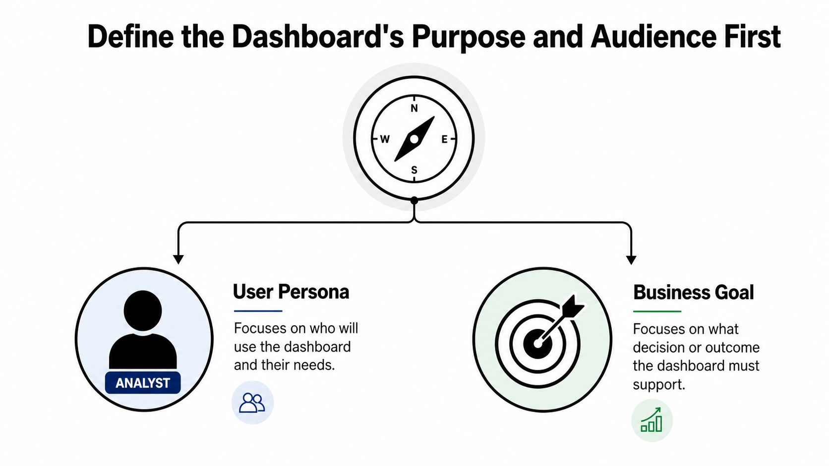
Start with one question. Who is this for, and what decision should it help them make? If you can't answer that in one sentence, you're not ready to build anything.
A dashboard for an owner is not the same thing as one for a controller, an operations manager, a lender, or a board. That sounds obvious, yet plenty of businesses try to jam everyone into one screen and end up with a Frankenstein dashboard nobody trusts. The clean move is to define one main purpose, then refuse every metric that doesn't support it.
Scope the dashboard before the first chart
Write down the three or four business questions the dashboard has to answer. Not ten. Not “everything important.” Just the few questions that drive action this week. One guide on performance dashboards recommends limiting each project to a maximum of three to four objectives, then defining the questions, metrics, targets, and data conditions for each objective before assigning a business owner and a data steward (UPI-YAI's performance metrics workflow).
That scoping discipline matters because your dashboard should have a reason to exist. A finance dashboard, an executive dashboard, and an operations dashboard can overlap a little, but they should not be identical. Board-level guidance also pushes the same discipline, saying metrics should have predictive power, combine financial and non-financial indicators, and stay separated from narrative so you can see whether a change is a trend or just noise (Board Intelligence's KPI dashboard guide).
A Jacksonville construction owner might want cash, job margin, and work-in-progress aging in one view. The operations manager wants crew utilization, schedule slippage, and which jobs are about to turn ugly. Those are different decisions, so they need different screens. A single giant dashboard usually becomes a compromise nobody uses.
Build for the user who has to act
If the owner can't use the dashboard to make one meaningful decision faster, the dashboard is too broad. If the operations lead can't tell what to do when a metric goes yellow, it's too vague. If the controller has to explain the same number twice, the definition is bad.
A good dashboard has a clear audience and a clear purpose. That's what protects it from metric sprawl later, when everybody suddenly wants their favorite number added “just this once.”
Pick KPIs That Match Your Industry and Your Decision
Start with the decision on your desk, then choose the KPI that tells you whether that decision is right. If you begin with whatever number is easiest to pull, the dashboard turns into a junk drawer, and nobody makes a better call because of it.
The core set is straightforward. Cash, revenue, gross margin, net profit, accounts receivable aging, and payroll-to-revenue are the numbers most small and midsize Florida businesses should know cold. After that, the right mix depends on the business model. A healthcare practice should watch days in AR and payer mix. A construction firm should watch job margin and WIP. Non-profits live and die by program expense ratio and fund balance. Retail and e-commerce owners need unit economics that show whether growth is profitable.
Match the metric to the business model
A KPI without a target is just a number with confidence issues. One guide says each KPI needs a baseline and a target so managers can tell whether the result is normal, good, or worth investigating (UCCS performance dashboard guidance). That is the standard I would hold to every time.
Here is the blunt version. If a metric cannot change a decision, drop it. Wrong KPIs are worse than no KPIs because they create false comfort and waste attention. If you want a clean reference point for how accountants think about meaningful measures, this KPI guide for accounting is the right mindset, because the numbers have to support judgment, not just reporting.
Starter KPI sets by industry
| Industry | Top 3 KPIs to Track First | Why It Matters |
|---|---|---|
| General small business | Cash, gross margin, accounts receivable aging | Tells you whether the business can pay bills and keep earning |
| Healthcare practice | Days in AR, payer mix, collection performance | Shows whether revenue is getting stuck after the visit |
| Construction and trades | Job margin, WIP, payroll-to-revenue | Reveals whether the work is actually profitable as it runs |
| Non-profit | Program expense ratio, fund balance, grant timing | Helps leaders stay mission-focused and financially stable |
| Retail and e-commerce | Unit economics, gross margin, inventory turnover | Shows whether volume is creating value or just activity |
Don't let the wrong KPI crowd out the right one
An owner once asked for “everything on one page.” That is how dashboards get bloated and useless. Keep the dashboard tight enough that a human can understand it without a meeting to decode it. If a number does not help you answer, “Should I hire, hold, cut, or chase?” then it does not belong.
Map Your Data Sources Before You Build Anything
Most dashboards fail because the data underneath them is messy. People blame the design, but the actual failure is upstream. If the source system is wrong, the dashboard just displays the wrong thing with better colors.
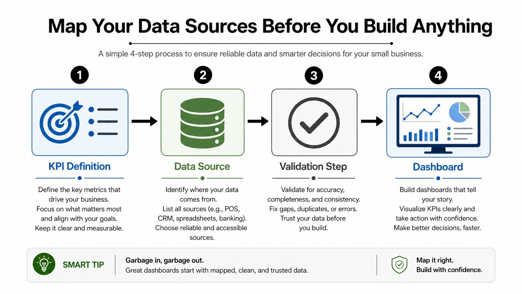
Your first job is to name the system of record for each KPI. Revenue, expenses, and receivables often live in QuickBooks Online. Labor cost and headcount usually come from Gusto, ADP, or QuickBooks Payroll. Construction firms may need job-costing tools and spreadsheets for WIP. Healthcare practices might pull from practice management systems. Retail owners often need CRM or point-of-sale exports for sales data.
Build the handoff map
The rule is simple. Every KPI needs a source, a refresh cadence, and a validation check. If you're pulling live data, you need confidence in the feed. If you're refreshing on a schedule, you need to know exactly when the last update landed. That's where plenty of teams get burned, because bank feeds don't categorize cleanly, payroll accruals don't get posted, or job-cost codes don't match between estimating and accounting.
A dashboard is only as honest as the mapping behind it. If you've ever wondered why data pipelines feel so annoying, this practical guide for CTOs on ETL versus ELT is a useful reminder that extraction, transformation, and loading choices affect what people eventually trust. The accounting version of that lesson is the same. Clean the handoffs before you polish the screen.
Practical rule: If the source data is messy, fix that first. Dashboard design won't save a bad number.
Make the source visible
That's why I like tying every KPI back to a named source system and a named person. It keeps the team from arguing over whose spreadsheet is “more correct.” It also lines up with the accounting habit of a clean chart of accounts, which is why a disciplined chart of accounts setup matters before any dashboard project gets serious.
When the map is clean, the dashboard stops being fragile. When the map is sloppy, every number becomes a debate.
Design the Dashboard So It Actually Gets Used
A dashboard has to answer fast. If the owner needs to scroll, decode, or hunt, the design already missed the point. Layout matters as much as the KPI list, because people use what they can read under pressure.
The cleanest structure is the inverted pyramid. Put the headline numbers at the top, trends in the middle, and drill-down actions at the bottom. That matches how an owner thinks in the world. First, “Is anything wrong?” Then, “What changed?” Then, “What do I do about it?”
Keep the screen brutally focused
Do not cram the screen. Once a business performance metrics dashboard starts piling on every metric the team can find, the owner stops trusting it. The usual range is 5 to 7 metrics on the page, and more often than not that is enough to tell the truth without burying it in clutter. A separate guide also lands in the same place, saying teams usually settle on three to seven metrics once they define the audience and the question they need answered (AppDeck's KPI dashboard examples). I agree with the direction of that advice. More metrics usually means weaker decisions.
Use red, yellow, and green consistently, and define what each color means before launch. Do not make the user guess. Every number needs context against a target, a prior period, or a benchmark. A raw number by itself is trivia. A number against target is management. A number against history is a decision aid.
If a color means one thing in finance and something else in operations, the dashboard is already working against you. Fix that before rollout.
Build for comparison, not decoration
Filters matter because owners do not manage averages. They manage regions, teams, channels, departments, and time periods. A useful dashboard lets you slice the story by the part of the business causing the issue. If a number goes red and there is no drill-down, you built a poster, not a tool.
- Headline metrics first: Cash, margin, AR, payroll, or whatever the owner needs to see immediately.
- Trend charts second: Enough history to spot movement, not so much that the screen turns into a graveyard of lines.
- Drill-down last: Segment filters, transaction detail, and exceptions only after the high-level answer is clear.
That order matters because a dashboard is not decoration. It is a working screen for a decision maker who has five minutes, maybe less, and wants to know where the business is bleeding. If you are building with code or custom tooling, interactive dashboards in Python can work well, but only if the layout stays disciplined and the drill-downs stay tied to a real question. Keep the screen honest. Delete anything that does not change a decision.
A useful test is to remove one metric from every draft. If nobody would act differently after it disappears, it never deserved space. That is the fastest way to stop dashboard bloat before it becomes permanent.
Launch Checklist for the First 30 Days
A dashboard launch should feel like a controlled rollout, not a leap of faith. The first month is where you find out whether the numbers are trusted, whether the team understands them, and whether the owner looks at the thing when pressure hits.
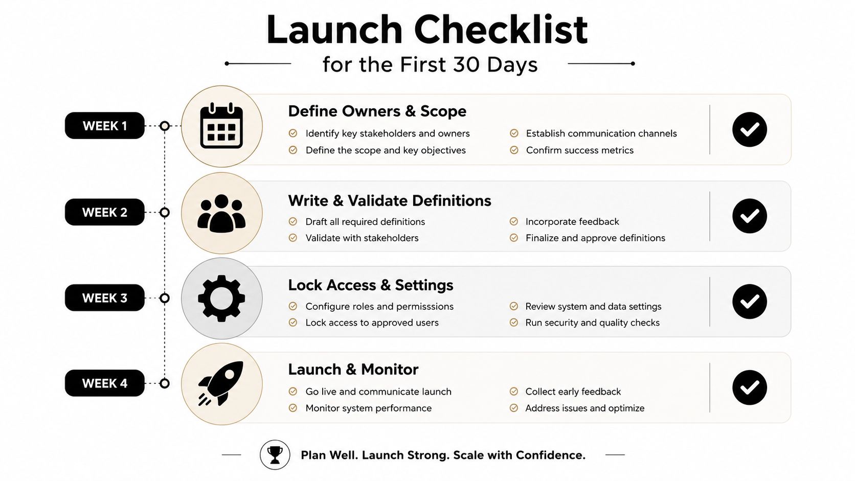
Week one is about definitions and ownership. Write plain-English definitions for every KPI. Name the owner. Lock the source system. Then compare the dashboard numbers against a trusted report, whether that's a bank statement, payroll register, or filed tax return. If the numbers don't match, stop and fix the feed.
What the first month should look like
Week two is the build and reconcile phase. Make the views, test the filters, and compare the dashboard side by side with the monthly package the team already knows. If the dashboard and the old report disagree, don't pretend the dashboard is smarter just because it's newer.
Week three is training. Users need to know who sees what, what green means, what yellow means, and what to do when a number turns red. It is at this point that many teams realize the dashboard is only as good as the habits around it.
Week four is the first formal review. The owner, bookkeeper, and advisor should sit down together and ask three questions. Which metric changed a decision? Which metric confused people? Which metric needs to be removed or redefined?
For teams building on code or custom tooling, interactive dashboards in Python can be useful, but the technical stack doesn't matter if the rollout discipline is weak. The dashboard has to survive real use, not just the demo.
The first 30 days are a test
A dashboard is not done at launch. It's alive. The first 30 days tell you whether the chosen metrics help the owner make decisions, or whether the team just built another pretty screen nobody trusts after lunch.
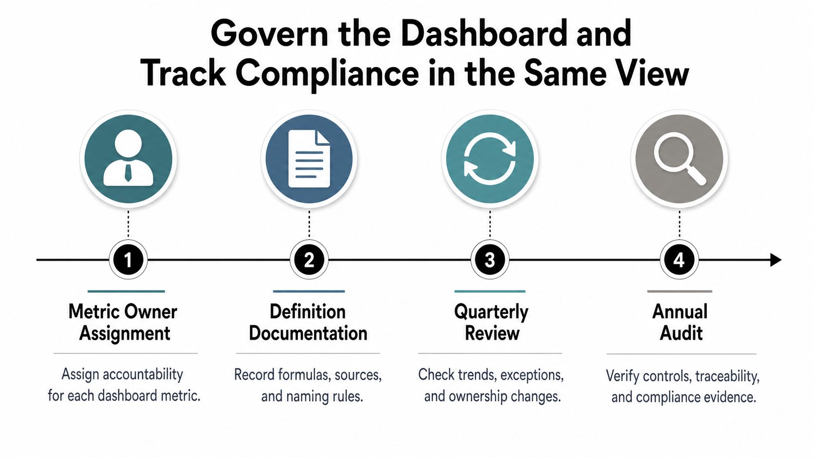
Govern the Dashboard and Track Compliance in the Same View
Most dashboards often get too polite. They show business performance, but they ignore governance. That's a mistake, because a metric without an owner and a review cadence eventually turns into a rumor.
Every KPI needs a definition, owner, target, and review rhythm. Fast-moving numbers like cash and receivables deserve weekly attention. Slower items like margin and tax exposure can sit on a monthly rhythm. Keep a metric dictionary so two departments don't define the same number in different ways. If finance calls it one thing and operations calls it another, the dashboard lies by accident.
Put compliance on the dashboard, not in someone's inbox
A fractional CFO demonstrates their value here. The dashboard should track compliance items with the same discipline as operational KPIs. That means deadlines, owners, and status flags for items like 1099-K reporting, 1099-NEC filings, sales-tax remittance dates, payroll-tax deposits, and Corporate Transparency Act beneficial ownership reporting.
The IRS's current 1099-K threshold is $5,000 for tax year 2024, and the phase-in matters because businesses that accept card or third-party network payments need to know when the rule hits them (IRS-related threshold guidance in Pedowitz Group's dashboard guide). The same source also notes that Corporate Transparency Act reporting was originally set so most reporting companies formed before 2024 would file by January 1, 2025, while newly formed companies generally had 90 days to file in 2024. Those are exactly the kind of dates small-business owners miss when nobody owns the process.
Plain truth: Most small businesses don't know what's required until the deadline has already passed.
Make accountability visible
The same governance logic applies to performance metrics. One source says the biggest failure point is packing in too many metrics while nobody owns interpretation or updates, and that gap is exactly where dashboards go stale (Fanruan's executive summary dashboard guide). If nobody is responsible for the definition, the update, and the review, the dashboard becomes decorative fast.
A dashboard that tracks both business performance and compliance gives you one place to see what's happening and what's due. That's the core value. Not more data, better decisions.
Bookkeeping and Accounting of Florida Inc. helps Jacksonville and Northeast Florida owners turn messy books into a business performance metrics dashboard they can use, with clean reporting, fractional CFO guidance, and compliance oversight built around the numbers that matter. If you're tired of guessing at cash, payroll, taxes, and deadlines, visit Bookkeeping and Accounting of Florida Inc. and let's get your dashboard working the way a real decision tool should.